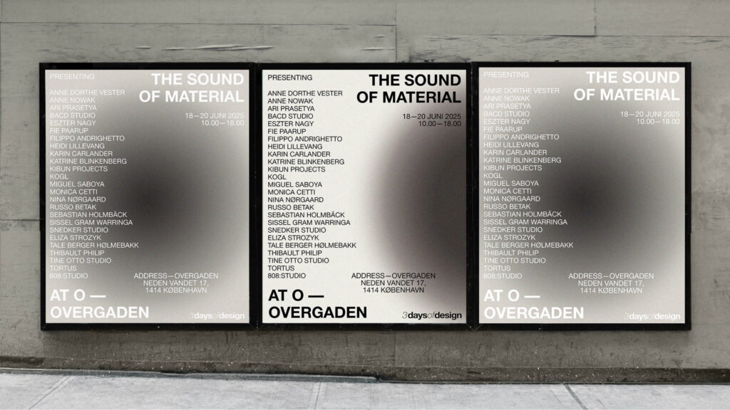
A visual and digital interpretation of the title.
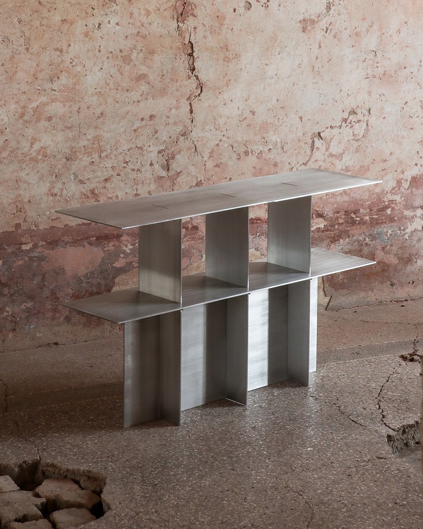
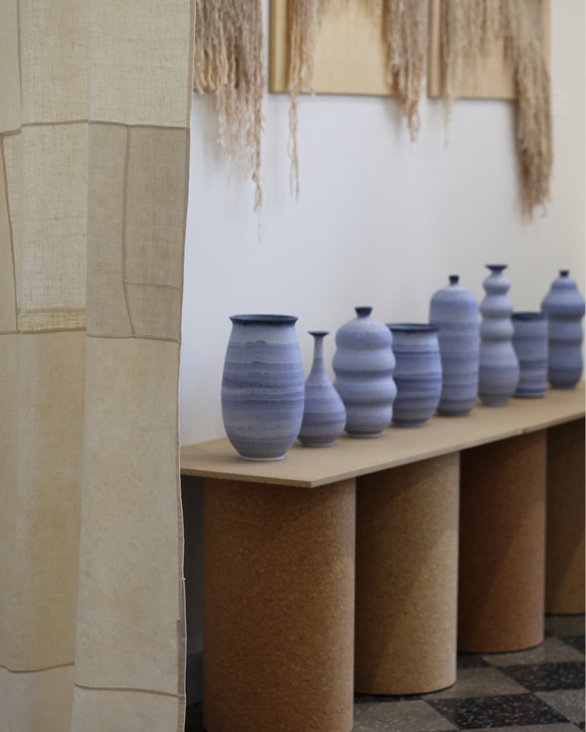
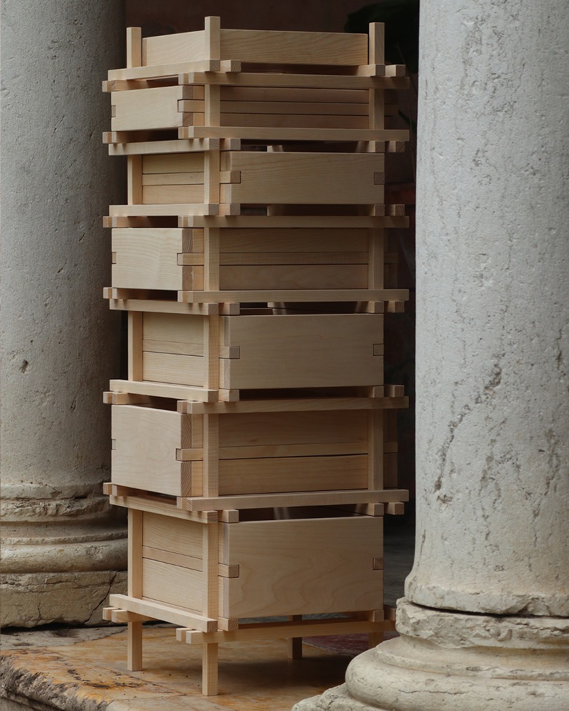
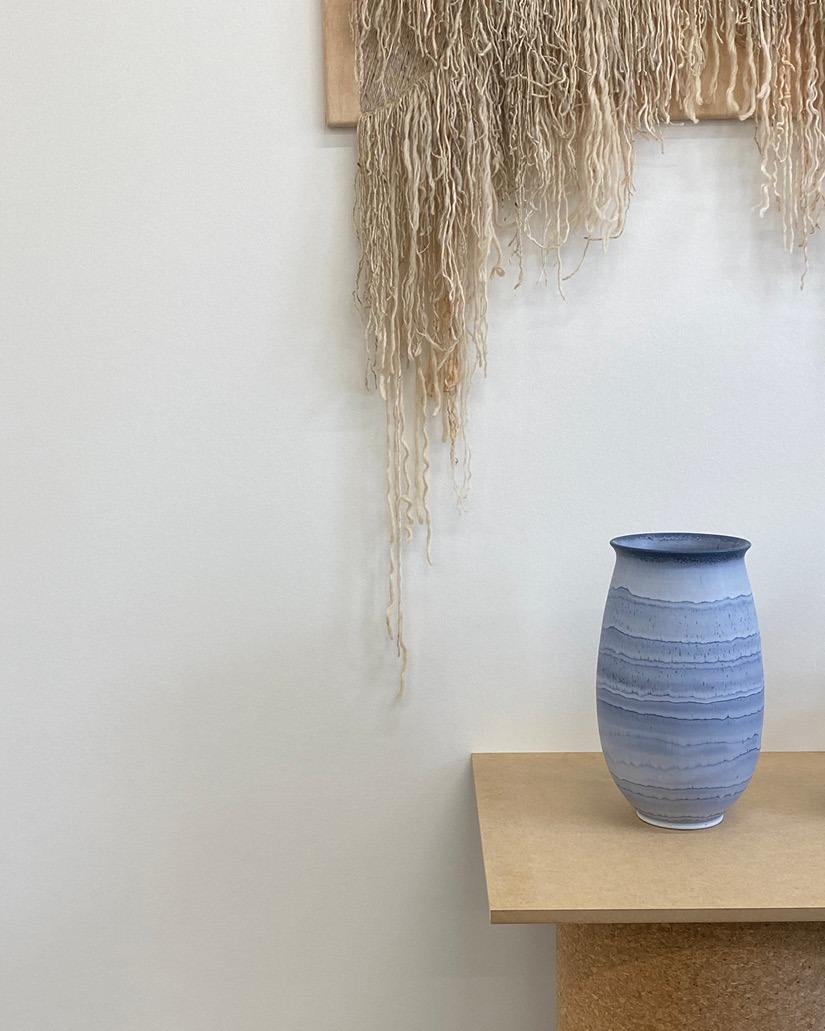
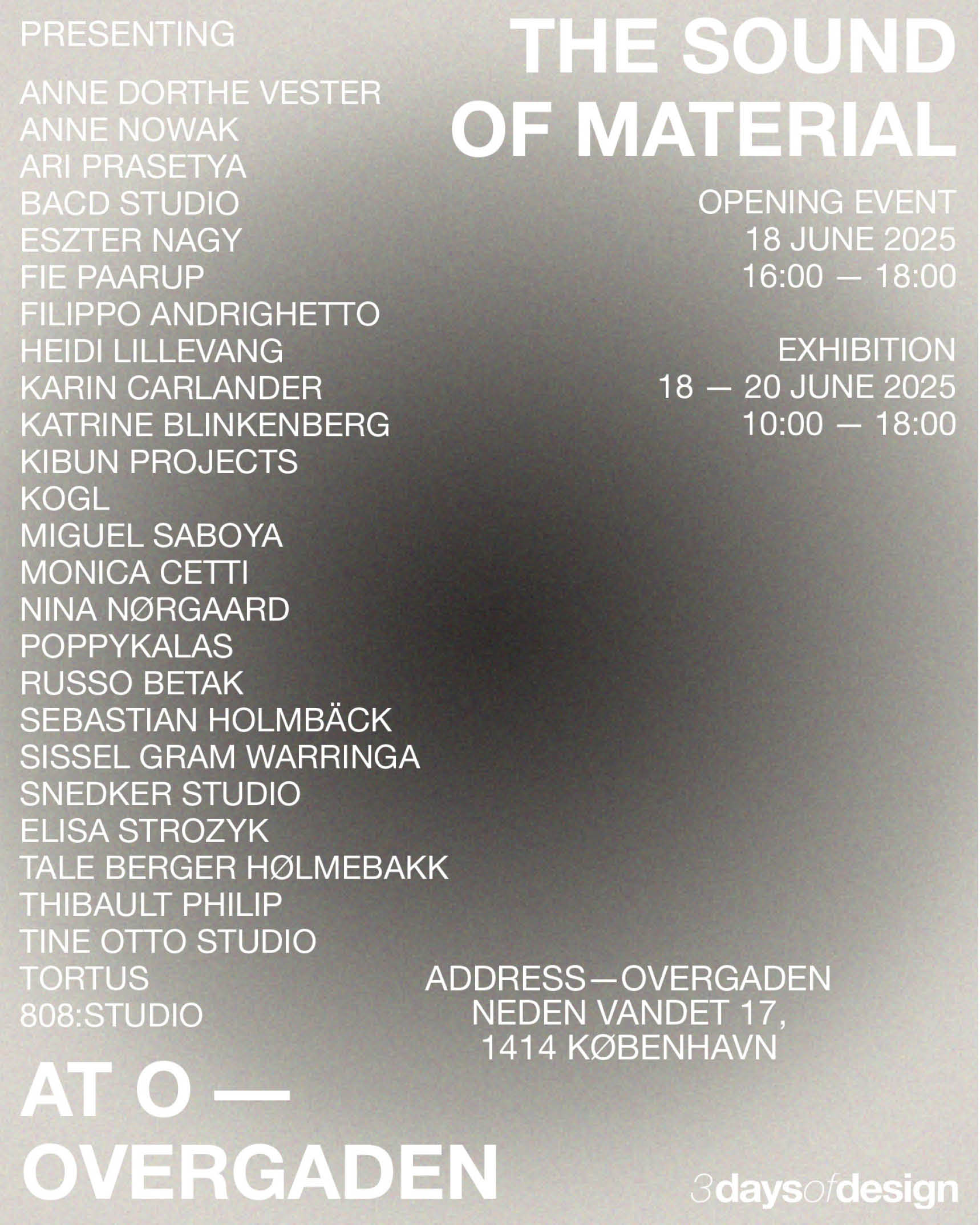
The Sound of Material The exhibition design was inspired by a deep bass sound that expands and contracts. This design was meant to slow things down and invite reflection. It was built from simple components: a monochrome colour palette, Helvetica Neue typeface, and added image grain to enhance tactility. The overall expression is slow, monochrome, and understated, allowing the exhibitors and the exhibition itself to take centre stage.

Graphic for Instagram Stories
Instagram Reel Invitation
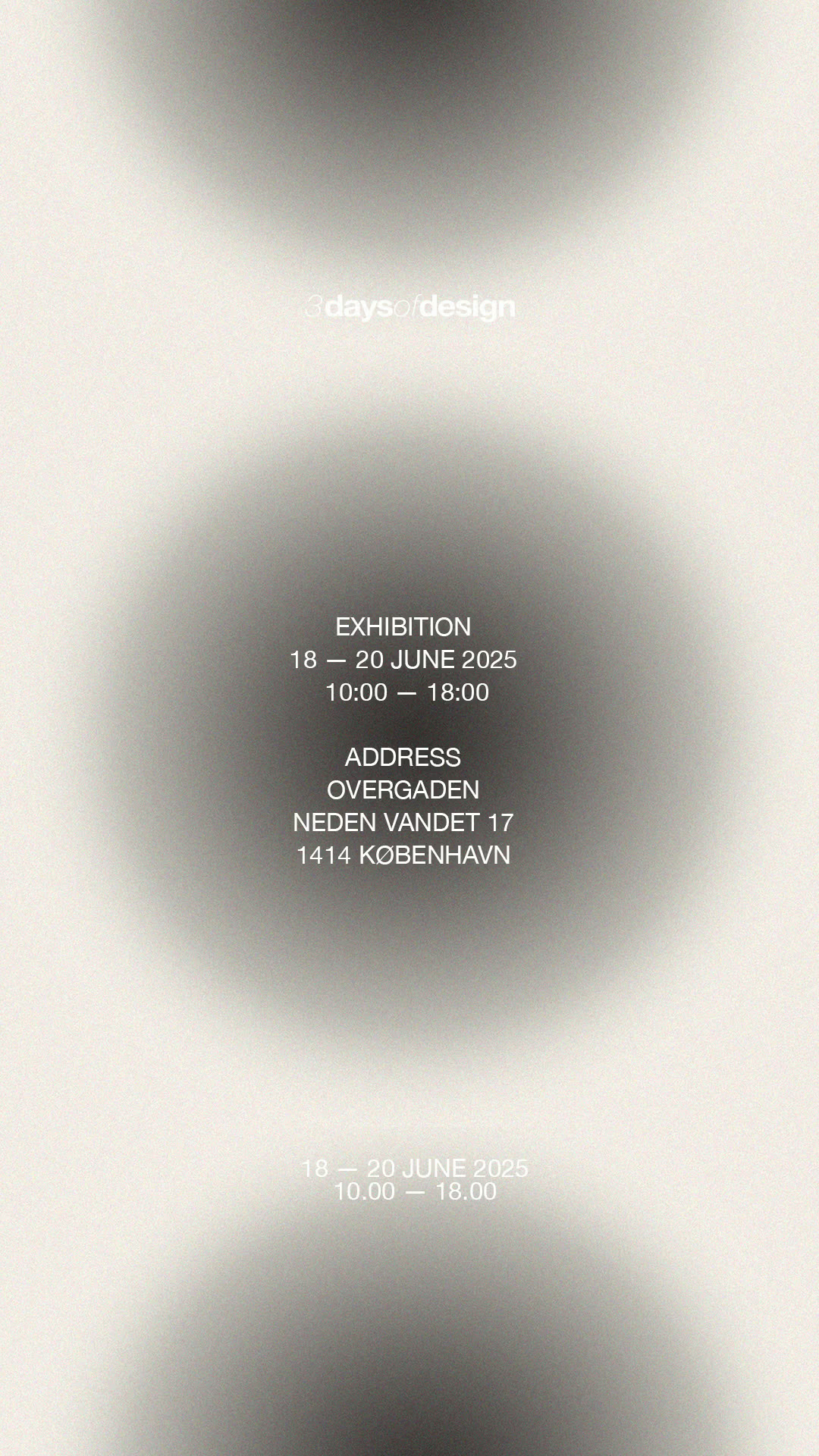
Graphic for Instagram Stories
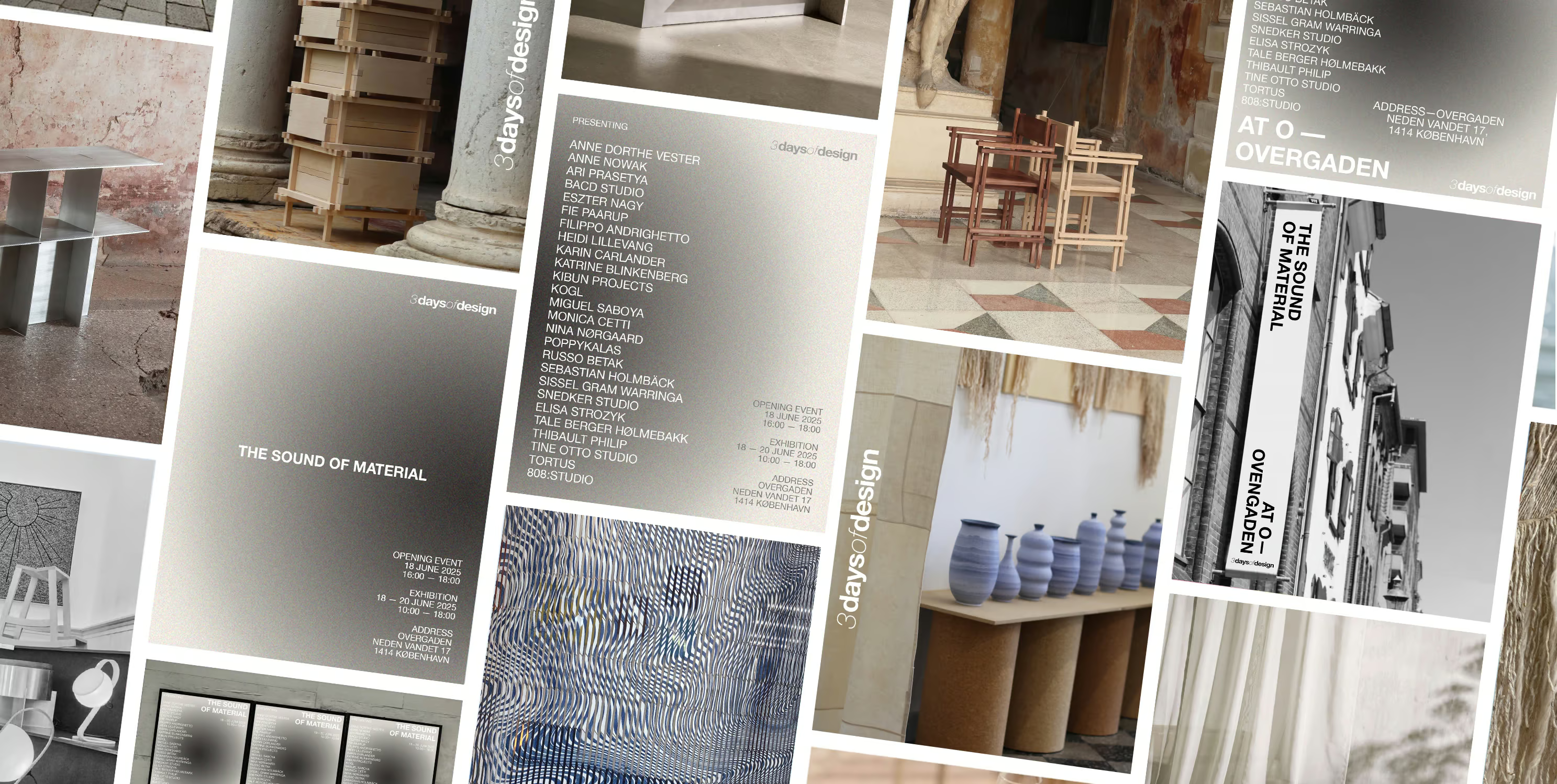
Social media content for The sound of Material - 3daysofdesign